Wide screen on YouTube is going to change your workflow and it will encourage you to be even more creative. From now on, the player of YouTube is set to 640 x 360 pixels, which is actually equal to the dimensions of a High Definition Video (HDV) or 16:9 aspect ratio. The previous size was 480×360, with an aspect ration of 4:3. In fact, HDV has a typical film format while Standard DV compares with the television format. Yet, television is changing format also, so 16:9 is going to be the new standard and that means that your old video camcorder with standard dv footage may become obsolete at some point. Luckily, there is a way to postpone the need to buy a new camcorder and I will show you how.
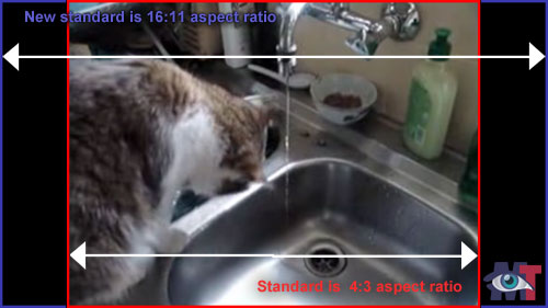
In any case, you do not need to throw your old videos away, they will play with a black column on the left and right side, as you can see in the sample above. In fact, they are still the same in height as they were before, namely 360 pixels.
HD is all the rage now
Yet, HD is all the rage now, so everybody will be forced into that format on YouTube. I’m not sure this is a good idea, actually. It would have been smarter if you had a choice of aspect ratio, because let’s face it, it doesn’t look too good with those black columns on either side, does it? It looks a bit like: “Oh, look! They still work with an old camcorder !“.
So far, Brightcove was a lot smarter in this respect; whatever format you uploaded on that video network, Brightcove gave you the matching player. No black borders or anything. Alas, from the 17th of December onwards, the free ride on Brightcove is over. See also: Brightcove: end of the free ride.
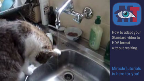
Spice up that “old” formatted video!
You can use some tricks to make your (relatively) older videos fit into the new format without resizing. See this article on how to make your video bigger without resizing. The part about stretching is not accurate in this situation, but the rest is very useful as a model to work with. You could, for instance place a banner of 160 pixels wide, either on the left or right of your video and the problem is solved. See sample below:
I often used HD footage in order to move around in post production and cover unesthetic parts of the video. Now I have to be much more careful about framing the subject, so it is going to be a bit more challenging for all of us. But it will be exciting as well because this format opens doors to new possibilities and it will encourage us to become more creative as we have a wider horizon now, literally 🙂
I have an “old” 4:3 lcd monitor (a whopping 3 years old) and have started noting that websites do not fully display, that is, I have to scroll right/left to see the full screen. I recently moved to IE 8, not sure if that is why, I have looked everywhere and this is the first reference I have found to the widescreen trend. Now that the trend seems to be widescreen and HD, both on the internet and on TV, some of the older stuff looks real bad in HD. I guess we are at another technology step up, amazing. 5 years ago every monitor we were using was still a CRT. So, if there is any way to change settings in IE 8 running on XP Pro SP2 so I can see the full width on this monitor please advise!
Hi Larry,
As your lcd monitor is (only) 3 years old, you should have no problems viewing a site but some sites are simply too wide. Guessing the resolution of your monitor, it is must be about 1024×768. You can change it by right-click on an empty space on your desktop and in the context menu, select Settings.
A dialog box with several tabs appears. Then, select the tab Advanced Settings.
In that tab you will find a dropdown menu with various resolutions. Try 1200×800 (or anything near that resolution like 1100x something)) and press Apply.
Don’t get shocked if text suddenly looks a lot smaller.
If it looks fine, that means, if it feels comfortable enough, click OK, otherwise try a lower resolution and click Apply again.
If you have an older 15 inch lcd, often 1054×768 is the maximum, while if it is a 17inch, you’ll get away with 1200×800.
It depends really on the size of your monitor, not so much the aspect ratio (4:3).
Hope this is helpful?
My monitor is a 19″ running at it’s highest possible resolution of 1280×1024. It is only in the last week or two that I have noticed that full web page widths do not display without having to scroll right/left. I have fiddled around with all of the settings I can think of, IE 8 does not seem to have much to offer in settings adjustments. I looking at new monitors, some indicated (a Samsun 24″) that it automatically adjusts for proper screen format for display of content.
Thanks for your input!
With that resolution and size you should have no problems. I think you have to reset the size of the Text in IExplorer or the Zoom factor.
Can’t think of anything else why you would have horizontal scrollbars.
Both can be found under the Menu “View”.
For Zoom, see if it is set to 100%.
For Text size, set it to Medium.
Hope this helps?
Your monitor should still have a few years in it without problems, it is big enough.
It became clear it had to be a system or program setting, not a monitor setting, as I am using my laptop without the monitor, and the same issue. Zoom was it, it was set to 150%. I do not recall changing that, but it would not be the first time a setting “automatically” … or is it “magically”… changed on one of my computers. No more horizontal scroll bar. Thanks for your help!
Larry